Google Maps has a new look on iOS and Android today to celebrate turning 15 on February 8. The app icon is all-new – a less playful icon with a multi-colored location pin, set on a white background – and many features that were previously hidden within the hamburger menu have moved into front-and-center tabs along the bottom. From a report:
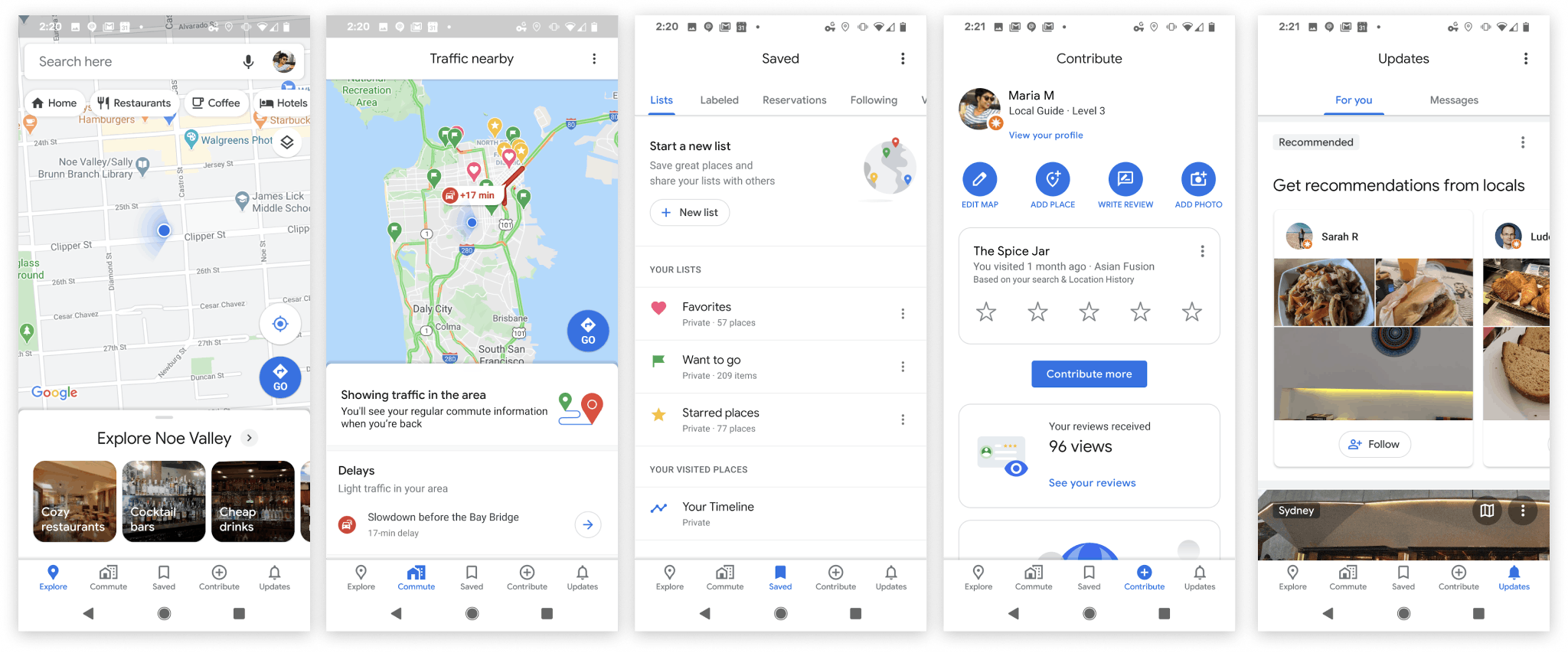
There are also several new features that integrate shopping, reservations, and Google Lens, and Google Translate. Google says the Maps app redesign makes it more useful – to help people better plan their trips – but as I was briefly walked through each of the new features, I couldn’t shake the fact that the app is still doing too much. Instead of trimming the fat, Google is doubling down with more features. Maybe it’s time Maps went on a diet. Google has always been stronger at rolling out useful features than making software good-looking.
- But too many features at the expense of functional design is a big loss for users who have no choice but to accept a poorer experience. I’m not saying the new Google Maps app is bad, I’m just saying it still feels bloated because Google has integrated so many of its other services into it and may never return back to a simple maps app. Simplicity is arguably better.
Fun trivia : Google Maps wasn’t supposed to be unveiled the day it did, and even then it was going to be in beta – but a reader guessed the URL correctly and posted it on Slashdot.
 !
!