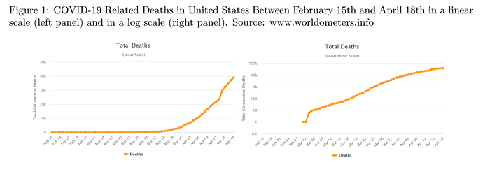
Mass media routinely portray information about COVID-19 deaths on logarithmic graphs. But do their readers understand them? Alessandro Romano, Chiara Sotis, Goran Dominioni, and Sebastian Guidi carried out an experiment which suggests that they don’t. From a report:
The fact that the framing of information can dramatically alter how we react to it will hardly surprise any reader of this blog. Incidentally, the canonical example of framing effects involves an epidemic: a disease that kills 200 out of 600 people is considered worse than one in which 400 people survive. Whereas this imaginary epidemic was just a thought experiment, an actual global pandemic turns out to be an unfortunate laboratory for framing effects. In a recent experiment, we show how framing crucially affects people’s responses to one of the most important building blocks of the COVID-19 informational puzzle: the number of deaths. We show that the logarithmic scale graphs that the media routinely use to display this information are poorly understood by the public and affect people’s attitudes and policy preferences towards the pandemic. This finding has important implications because during a pandemic, even more than usually, the public depends on the media to convey understandable information in order to make informed decisions regarding health-protective behaviours.
Many media outlets portray information about the number of COVID-19 cases and deaths using a logarithmic scale graph. At first sight, this seems sensible. In fact, many of them defend their decision by showing how much better these charts are in conveying information about the exponential nature of the contagion. For history lovers, the popular economist Irving Fisher also believed this, which led him to strongly advocate for their use in 1917 (right before the Spanish Flu rendered them tragically relevant). Fisher was ecstatic about this scale:
“When one is once accustomed to it, it never misleads.” It turns out, however, that even specialized scientists don’t get used to it. Not surprisingly, neither does the general public. We conducted a between-subjects experiment to test whether people had a better understanding of graphs in a logarithmic or in a linear scale, and whether the scale in which the chart is shown affects their level of worry and their policy preferences. Half of our n=2000 sample of US residents was shown the progression of COVID-19 related deaths in the US at the time of the survey plotted on a logarithmic scale. The other half received exactly the same information – this time plotted on a good old linear scale. […]
