An anonymous reader quotes a report from MIT Technology Review:
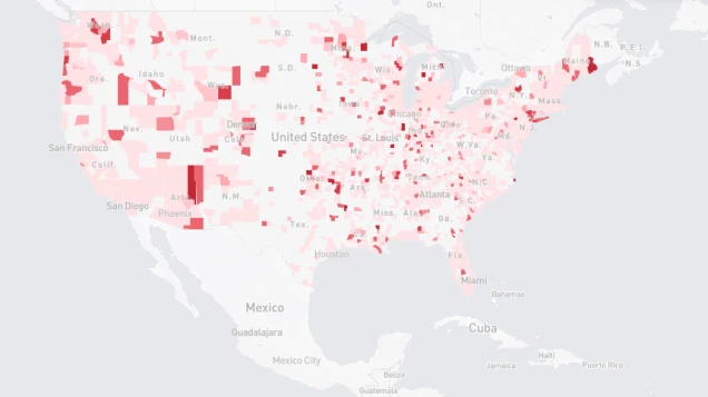
Facebook has released a map showing the proportion of people who say they have experienced coronavirus symptoms in each state in the US. The data was gathered from more than one million Facebook users who filled in a survey created by Carnegie Mellon University about whether they were experiencing symptoms like a cough or a fever. The map, which goes down to county level, will be updated every day. Facebook says it will create similar maps for other countries in the coming days and weeks, also based on survey responses.
Knowing who is experiencing symptoms and where could help health officials and governments to prepare for surges of hospital cases and decide where to allocate resources like ventilators, face masks, and personal protective equipment. Given the shortage of tests, and long delays for results, this map could be useful in helping to predict where COVID-19 hot spots are forming across the U.S. Obviously, the map is only as good as the data that’s used to create it, and as you can see for yourself, vast swaths of the map don’t have enough participants to yield reliable data. The map is part of Facebook’s work with CMU and the CDC to predict the coronavirus’s spread.